Use Data-Driven Strategies to Power Auxiliary Success
"What is one thing every successful person or company has in common?" This is the first question Kaitlin Windle, Founder of Apte, asks in her webinar "Data-Driven Success: Evaluating Your Summer and Auxiliary Programs." The answer: "They are goal-oriented and they get their numbers." Armed with data, they can make strategic decisions in the present that affect the future. And over time, they're able to measure and evaluate progress toward their goals.
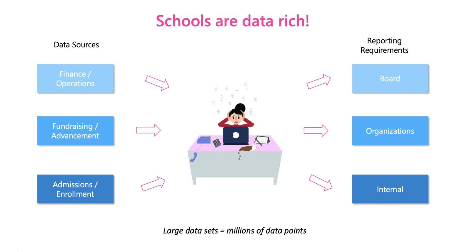
With long-term financial stability a concern in many independent schools, summer and auxiliary programs--often run as a "business within a business"--are becoming a key player in bolstering non-tuition revenue. Kaitlin notes that schools are fluid and rich in data, which is both a challenge and a strength. Auxiliary must pull data from multiple departments, often siloed off from one another. Gathering, storing, evaluating, and presenting this is vital to the success of their programs.
The Power of Metrics
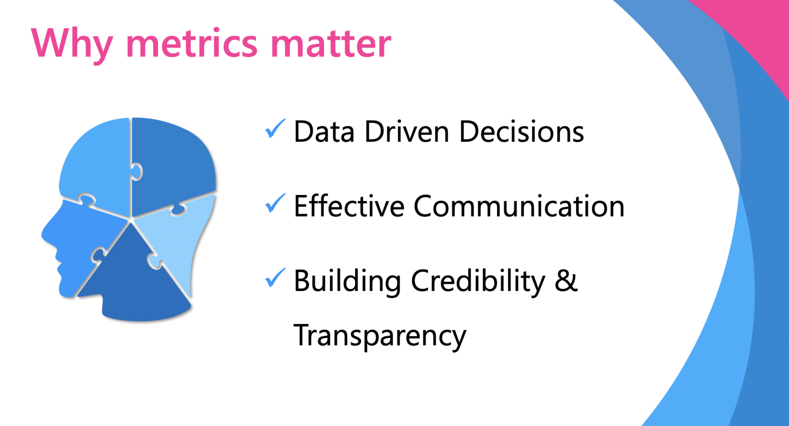
Data powers intentionality. Evaluating data means you can to make decisions grounded in knowledge about what is working, what isn't, and how to best strategize for the future. When you need to speak with team members or school leadership, having numbers to back your requests or decisions builds credibility, creates trust, and allows for clarity and transparency in communication.
And when it comes to presenting data, visuals are far more effective than a balance sheet.
The Power of Visualized Data
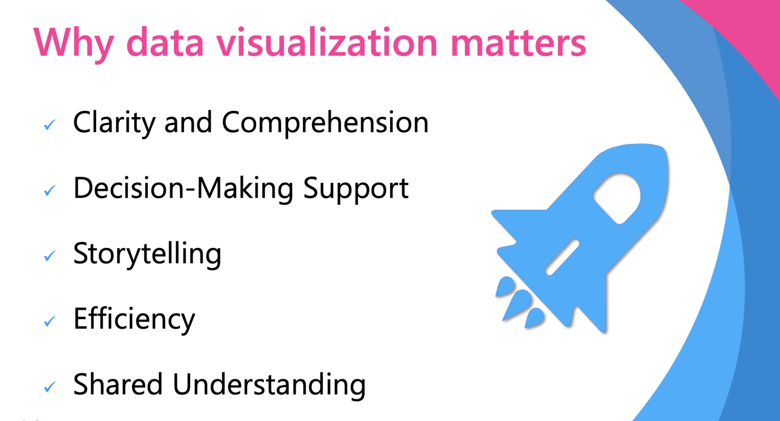
When Kaitlin founded Apte, it was to create a centralized system where schools could store and analyze data gathered from multiple sources. With numbers readily available, auxiliary departments can more clearly and quickly understand budgets, fundraising progress, expenses vs. revenue, and which classes or programs are filled or which need extra marketing.
Visualized data is more quickly comprehended, making it easier to gain support from stakeholders when you need to make changes or launch new programs. Consensus is more quickly reached. In particular, storytelling becomes more effective with data presented in visual form as opposed to a spreadsheet.
Example 1: The Numbers Vs. The Picture
In Kaitlin's example, she asks what you can tell from the numbers in this report:
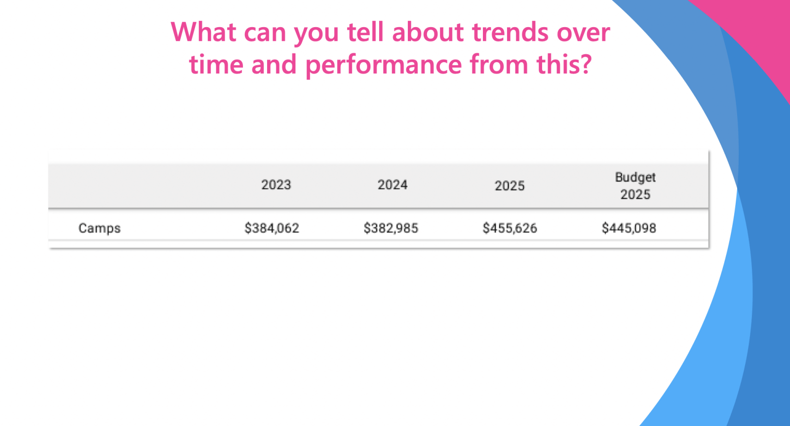
We can see that after two years of stable numbers, there's a marked increase between 2024 to 2025. But there's no story to tell, because we don't know why or when this extra revenue was created.
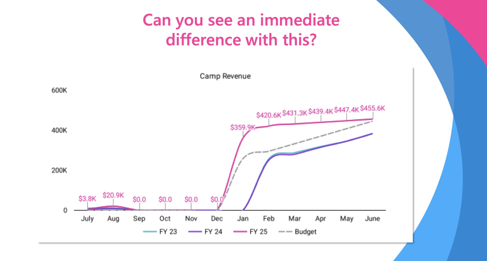
When the same data is shown visually, in a simple line graph with each year's revenue delineated by color, the story becomes clearer and easier to communicate. We can see a surge in revenue beginning in December of 2025, when in the previous two years, a similar bump didn't occur until January. The story is that the camp opened registration a month earlier, resulting not only in an earlier surge in revenue, but in greater overall revenue.
This relatively small change resulted in a huge win for the camp and for the school. Armed with this data, camp leadership can see and communicate how this change benefits the school, building credibility, trust, and value for their department.
Example 2: Revenue Vs. Expenses
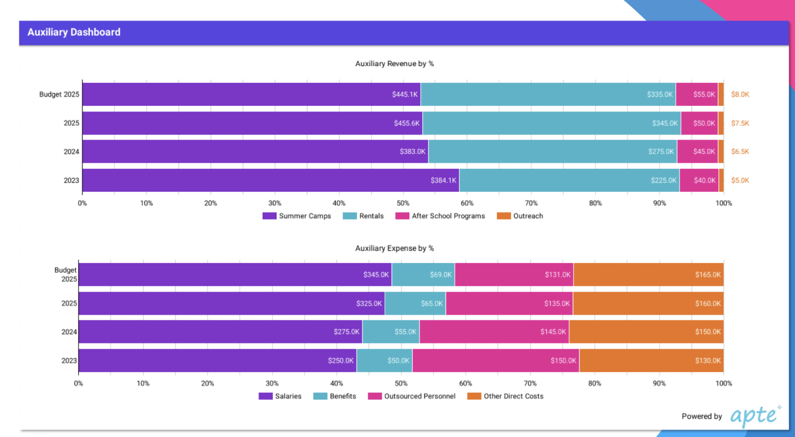
In this bar chart, sources of auxiliary revenue and expenses are delineated by color. Looking at the top half in revenue, we can easily comprehend that the biggest shift happens in rentals (blue).
The story here is that this was an intentional decision. Recognizing the growing profitability of facility rentals, leadership decided to invest more, resulting in greater revenue. With this chart, they can effectively see and communicate the success of their strategy and track over time how it continues to help them meet their financial goals.
Kaitlin also uses this chart to stress how using data-driven decisions to optimize revenue allows for programs that may not be profitable, but are mission-aligned. In the orange bar under revenue, we see that this auxiliary department's outreach programs do not generate much money, if any. But they are critical to the school's mission to connect with and provide opportunities to their community. The success of other programs allows for the school to pursue their mandate of community outreach.
Final Hot Tips
Kaitlin leaves us with a few tips to keep in mind when making data-driven decisions.
- Keep goals simple and easy to remember. Big, round numbers are best. You'll always have them in mind and they'll be easier to execute and present.
- Do not ask the board "What do you want to see?" Use your numbers to guide them. Come prepared with ideas and show them what you can offer.
- Keep reports consistent. Don't change metrics in the middle of the year.
- Track metrics monthly. Waiting until the end of the year is too late.
- The best time to present numbers is when your numbers are down. This is the time to take a candid look at what needs to change and how the data can inform and support these changes.
SPARC members can watch Kaitlin's webinar or review her slides here.
Webinars like Kaitlin's "Data-Driven Success" are FREE for all SPARC members. Join us today for more professional development resources and a wealth of auxiliary community support with SPARC Connect.